
Around their second birthdays, four to eight percent of American children previously identified as healthy are classified as underweight. What affliction is overtaking these children? Growth charts.
Obviously, the growth charts themselves aren't responsible for children's ill health (and, in fact, most of those children aren't in ill health). But our systems for measuring children, often understood differently by physicians and parents, affect how we define health.
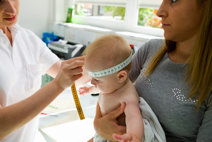
The first nationwide growth charts, developed by the National Center for Health Statistics (NCHS) in 1977, were based on one of the world's longest running longitudinal studies at the time, the Fels Longitudinal Study. The study, which began in 1930, measured children, and eventually, those children's children, grandchildren, and great-grandchildren.
The NCHS 1977 growth charts, based on nearly 50 years of data from the Fels study, provided a good, if imperfect, picture of childhood growth. For example, children studied during those decades were more likely to be formula fed, which made their first-year weight gains somewhat higher than comparable breastfed infants. Because of its location in Yellow Springs, Ohio, the Fels study enrolled mostly white, middle-class children, who were not representative of the U.S. population as a whole. In 2000, the CDC released revised charts based on nationwide data.
The CDC charts were not intended to be a standard all babies needed to meet, but rather a reference for physicians to monitor growth, because slow growth was understood to be a risk factor for health problems like cystic fibrosis or celiac disease. Once these charts were shared with parents who wanted more information about how their children were growing, the charts gradually became viewed as standards.
The World Health Organization, recognizing this shift toward standardization, decided that if people were going to treat the growth charts as standards, growth charts should be based on the healthiest possible kids. To create a chart that described infant growth under "optimal conditions," the WHO gathered data about infants born in six cities around the world chosen for their high socio-economic status, breastfeeding, and other factors. Because the WHO charts more accurately reflect the U.S.'s current population of breastfed infants, the CDC and other organizations recommend the WHO charts for children aged zero to 24 months.
Those newly underweight children at the top of this article are not suddenly falling ill at age two. Instead, many American two-year-olds are switching growth charts. Because they are based off of different populations, the WHO and CDC growth charts have slightly different growth curves.
When children are switched from the WHO growth chart to the CDC growth chart, they have a tendency to shrink. For example, at two years of age, a boy weighing 12kg falls at right about the 50th percentile of the WHO’s growth chart. That same boy, measured on the CDC’s growth chart, would fall closer to the 25th percentile.
The WHO and CDC charts are substantially different for children at the bottom of the curve. While the WHO chart categories under three percent of children aged six to 23 months as low weight for age, the CDC chart identifies seven to 11 percent of children as low weight for age.
Children also lose an average of about a centimeter when switching from the WHO charts to the CDC charts, not because of international differences in height, but because one chart is based on length (measured while laying down) and the other is based on height (measured while standing up).
American pediatricians, likely recognizing the potential for panic over all those shrinking two-year-olds, have developed a few workarounds when shifting from one set of growth charts to another. Many pediatricians provide parents with charts that plot their children’s height and weight over the period of multiple visits, showing a clearer progression from visit to visit.
Others shift from the WHO chart to the CDC’s birth-to-age-three chart. Still others provide additional charts (weight-for-length and BMI, for example), so that parents have a more complete picture of their children’s growth.
Children on the other side of the growth curve present a different sort of interpretive problem. Percentiles merely describe how a child compares in relation to other children his or her age, but those percentiles are often interpreted as value judgments. A 2007 study in Pediatrics asked parents to interpret growth charts and found that parent-respondents were more likely to interpret a child measuring in the 90th percentile as “normal” weight than a child measuring in the 10th percentile.
It’s hardly surprising, then, that parents seem to be aiming for the higher percentiles. In a study published in JAMA Pediatrics, researchers found that parents of toddlers are remarkably poor at identifying their children's body size: 70 percent of mothers interviewed for the study inaccurately gauged their child's size. Parents of overweight toddlers were the worst estimators of their children's weight, often identifying their children as being of "normal" weight.
The authors attribute this difference to the cultural perception that heavier kids are a sign of good parenting. Growth charts, which depict weight in terms of increasing percentiles, might be helping support the parental notion that bigger is better.
One answer to the interpretive problems presented by growth charts has been to make more growth charts for different subgroups. Some charts are better for weighing very low birth weight children. A Children's HealthWatch study concludes that, because breastfeeding and other socio-economic factors make such an impact on the shape of growth curves, pediatricians should be cautious of using the WHO standards when evaluating low-income populations.
Any growth chart brings with it the same kinds of interpretive problems that lead us to think small is bad and big is good. It's not unusual that, once given growth charts, both parents and physicians would come to use them as standards instead of references.
The history of anthropometry – the study of measurements of the human body – is full of examples of body measurements being used as standards, as it was throughout our darker periods of slavery and eugenics. Growth charts have, since their origin, become a tool for measuring people against one another, a source of comparison and competition.
T.J. Cole argues that a growth chart, as a graphic design, is a “road to health” trajectory that we imagine our children have to follow. Many parents receive printed copies of their child's growth charts during visits to the pediatrician. It's hard not to view the string of dots as a form of progress – or, depending on the results of the weigh-in, failure.
Perhaps we could develop a new design. Instead of receiving a growth chart at each visit, imagine instead receiving a punch-out paper doll, scaled according to your child's most recent height and weight measurements. Imagine taking that doll home and adding it to the growing collection on your wall. Is the doll bigger, but proportional to the doll from the last visit? Did the doll shrink from last time? Is it widening? Is it elongating?
Your growing gallery might help you understand trends in your child’s growth without resorting to comparisons.


ParentCo.
Author